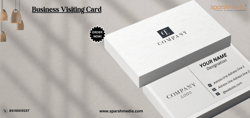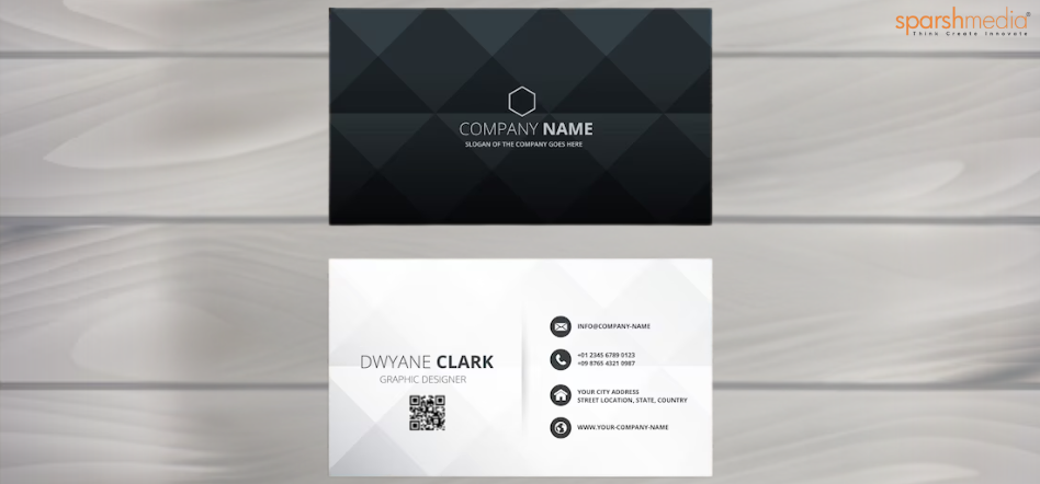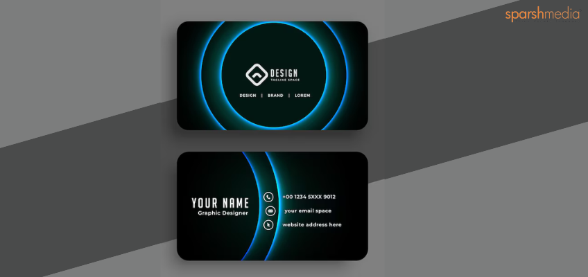
In today’s highly competitive business environment, first impressions are crucial. A premium business card is more than just a piece of paper; it’s a powerful tool that can convey professionalism, creativity, and reliability. At SparshMedia, we understand that a well-designed business card can set you apart from the competition and leave a lasting impact on potential clients and partners. This blog explores how premium business card can elevate your brand and offers practical advice on creating a card that embodies your business ethos.
Introduction
In the business world, the power of a first impression cannot be overstated. Despite the rise of digital communication, a premium business card remains a potent tool for making a memorable impression. For SparshMedia, a leader in premium business card, crafting a business card goes beyond mere information exchange — it’s about creating a tangible representation of your brand’s values and identity. This blog will delve into how a thoroughly designed business card can significantly enhance your brand and provide actionable tips for achieving a standout design.
Summary
This blog delves into the intricacies of premium business card and its role in brand building. We’ll explore the subtle art of design, discuss how to create maximum impact, and offer practical tips on choosing shapes, dimensions, styles, and finishes. Whether you’re a seasoned professional or just starting out, understanding these elements can help you craft a business card that truly represents your brand.
What makes a business card design “premium”?
A business card design is considered “premium” when it combines exceptional quality with thoughtful design elements to create a lasting impression. Here are key factors that contribute to a premium business card:
1. High-Quality Materials
-
- Paper Stock: Premium business cards often use high-grade, thick paper stock or unique materials such as textured or metallic papers. The heft and feel of the card can convey a sense of quality and behaving.
- Finishes: Special finishes like matte, gloss, or velvet lamination enhance the tactile experience and visual appeal.
2. Sophisticated Design
-
- Minimalist Aesthetics: A premium card often embraces a minimalist approach, focusing on clean lines, ample white space, and a balanced layout that avoids clutter.
- Custom Elements: Incorporating custom design elements such as unique shapes, foil stamping, embossing, or debossing adds a distinctive touch that sets the card apart from standard designs.
3. Attention to Detail
-
- Typography: High-quality fonts and careful attention to typography enhance readability and contribute to a polished appearance.
- Color Accuracy: Premium cards use high-resolution printing and accurate color reproduction to ensure that the design matches the intended vision.
4. Unique Features
-
- Special Finishes: Options like spot UV coating, metallic foils, or textured embossing can add visual interest and a tactile element to the card.
- Interactive Elements: Incorporating QR codes, augmented reality features, or die-cut designs can make the card more engaging and functional.
5. Consistent Branding
-
- Alignment with Brand Identity: A premium business card aligns closely with your brand’s identity, including its color scheme, typography, and overall style. This consistency helps reinforce your brand’s image and message.
6. Professional Design Execution
-
- Design Expertise: The card should be designed by a skilled professional who understands the nuances of layout, color theory, and typography. A well-executed design reflects the brand’s commitment to quality and attention to detail.
What are the best practices for designing a business card?
Designing an effective business card involves a combination of thoughtful design and strategic use of space. Here are some best practices to follow:
1. Keep It Simple and Focused
-
- Essential Information: Prioritize key details such as your name, title, company name, phone number, email address, and website. Avoid including excessive information that can clutter the design.
- Clarity and Legibility: Ensure the text is easy to read by choosing appropriate font sizes and maintaining high contrast between text and background.
2. Choose the Right Size and Shape
-
- Standard Dimensions: The most common business card size is 3.5 x 2 inches, which fits comfortably in most wallets and cardholders. However, don’t hesitate to explore unique dimensions if they align with your brand’s image.
- Shape and Orientation: Decide whether a horizontal or vertical layout suits your design better. Unconventional shapes or die-cut designs can make your card memorable but should be practical for everyday use.
3. Use High-Quality Materials
-
- Paper Stock: Select premium paper stocks like thick cardstock or textured finishes to give a high-quality feel. Options such as recycled paper or synthetic materials can also offer unique textures and durability.
- Finishes: Enhance the tactile and visual appeal of your card with finishes like matte, gloss, or satin lamination. Consider specialty finishes such as soft-touch coating or varnishing to add a distinctive touch.
4. Select Appropriate Typography
-
- Font Choice: Choose fonts that reflect your brand’s character while ensuring readability.
- Hierarchy and Alignment: Establish a clear hierarchy with varying font sizes and weights to emphasize key information. Proper alignment ensures a professional and organized look.
5. Incorporate Branding Elements
-
- Logo Placement: Position your logo prominently to reinforce brand recognition. Ensure it’s clear and appropriately sized to complement other design elements.
- Color Scheme: Stick to your brand’s color palette for consistency. Use colors strategically to highlight important details and create visual interest.
6. Leverage Both Sides of the Card
-
- Front Side: Typically reserved for essential information such as your logo, name, title, and contact details. Keep it clean and uncluttered.
- Back Side: Utilize this space for additional details like a company tagline, list of services, or a call to action. A well-designed back can provide extra value and encourage engagement.
The Subtle Art of Premium Design
Premium business card is an art form that combines aesthetics with functionality. The subtlety of premium design lies in its ability to balance elegance with practicality. A well-designed business card should reflect your brand’s identity while providing essential contact information in a visually appealing way. Key elements include:
-
- Minimalism: Less is often more. A clutter-free design ensures that your card is easy to read and visually appealing.
- Typography: The choice of fonts can convey professionalism and personality. Ensure that the typography is legible and complements your brand.
- Color Palette: Colors evoke emotions and perceptions. Choose a palette that aligns with your brand’s identity and message.
Designing a Business Card for Maximum Impact

Designing a business card for maximum impact involves more than just a visually appealing design. It should also serve its primary purpose: to leave a memorable impression. Consider the following:
-
- Clarity: Ensure that all critical information is easily readable and prominently displayed.
- Consistency: Your business card should align with your overall branding, including your logo, colors, and fonts.
- Unique Elements: Incorporate unique design elements or features that set your card apart from others.
Find Your Shape
The shape of your business card can play a crucial role in how it’s perceived and remembered. While traditional rectangular cards are standard, exploring unconventional shapes can make your card more eye-catching and memorable. Here are a few shapes to consider:
-
- Square Cards: These offer a modern and distinctive look that can make your card stand out. They’re ideal for creative fields where a unique presentation aligns with your brand’s image.
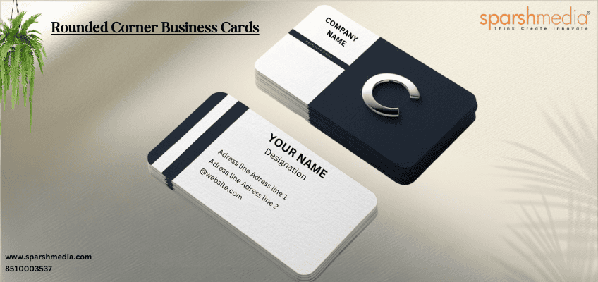
- Rounded Corners: Softening the edges of your card with rounded corners can make it feel more approachable and friendly. This subtle design choice can also enhance durability, as rounded corners are less likely to get bent or damaged.
- Custom Shapes: Tailoring the shape of your card to reflect your industry or brand can make a strong impression. For example, a fitness trainer might use a card shaped like a dumbbell, or a tech company might opt for a card with a circuit board outline. Just ensure that custom shapes are practical for storage and handling.
Helpful Info on Business Card Dimensions
Choosing the right dimensions for your premium business card business card is essential for both functionality and impact. Here are some widely accepted sizes:
-
- Standard Size: 3.5 x 2 inches (88.9 x 50.8 mm) is the most common size and fits easily into wallets and business card holders. It’s a safe choice for ensuring your card is easily accessible.
- European Size: 3.3 x 2.1 inches (85 x 55 mm) is slightly larger and commonly used in Europe. This size provides a bit more space for design elements and can be a distinctive choice if you want to stand out.
- Mini Cards: 2.75 x 1.1 inches (70 x 28 mm) offer a unique, compact format. They’re suitable for a minimalist design but may have limited space for information, so they work best with a clear and concise message.
Pick the Right Style
The style of your business card should align with your brand’s identity and the nature of your industry. Here’s a breakdown of different styles:
-
- Classic: A classic style is simple, elegant, and professional. It’s a safe choice for traditional industries like law, finance, or consulting, where a straightforward and polished appearance is important.
- Modern: Modern designs feature sleek lines, bold typography, and innovative layouts. They are perfect for tech startups, creative agencies, or industries where a cutting-edge image is key.
- Luxurious: Luxurious cards use high-end materials and finishes, such as embossed elements, foil stamping, and premium paper stocks. These are ideal for high-end brands or individuals in industries where an opulent impression is desired, such as real estate or high-end consulting.
Use Both Sides
Maximizing the use of both sides of your business card can enhance its effectiveness and provide more space for information:
-
- Front Side: Typically reserved for your logo, company name, and primary contact details. This side should immediately convey who you are and how to reach you.
- Back Side: Use this space to include additional information like a brief list of services, a company tagline, or a QR code that directs to your website or online portfolio. The back side can also be used for creative elements that reinforce your brand’s identity.
Include the Important Information
Ensure your business card provides all necessary details for potential clients to contact you. Here’s what to include:
-
- Name: Your full name or the representative’s name, clearly stated.
- Title: Your job title or role within the company to establish credibility and context.
- Company Name: Clearly display your business name for brand recognition.
- Contact Details: Include your phone number, email address, and website. Make sure these details are accurate and up-to-date.
- Address: If applicable, include your physical business address, especially if clients are expected to visit your location.
Decide on Special Finishes
Special finishes can add a unique touch to your business card and enhance its appeal. Consider the following options:
-
- Foil Stamping: Adds a metallic or glossy finish to specific areas, such as your logo or name. This can create a high-end, eye-catching effect.
- Embossing/Debossing: Creates a raised or recessed effect that adds texture and depth. Embossing can highlight elements like your logo, while debossing can provide a subtle, elegant touch.
- Spot UV Coating: Applies a shiny, high-contrast finish to selected areas, such as text or graphics. This can create a striking visual effect and draw attention to specific elements of your design.
Need Help Designing Your Business Card?
At SparshMedia, we understand the importance of a well-designed business card in making a memorable impression. Our team of design experts is here to assist you in creating a premium business card that aligns with your brand’s identity and goals. From selecting the right dimensions and finishes to crafting a layout that stands out, we offer comprehensive design services to ensure your business card reflects the quality and professionalism of your brand.
Contact us today to start designing a business card that will set you apart from the competition and make a lasting impact.
Conclusion
A premium business card is more than just a tool for exchanging contact information; it’s a reflection of your brand’s identity and professionalism. By focusing on subtle design elements, choosing the right shape and style, and utilizing special finishes, you can create a business card that makes a powerful impact. At SparshMedia, we’re dedicated to helping you unlock success through exceptional premium business card Embrace the power of premium design and elevate your brand’s presence today.
PLEASE MY ACCOUNT – SPARSHMEDIAPRINT
Frequently Asked Questions
How do I choose the right shape for my business card?
Selecting the right shape depends on your brand’s identity and the message you want to convey. Standard rectangular cards are practical and familiar, but square cards offer a modern look, while rounded corners add a friendly touch. Custom shapes can reflect your industry or brand but should remain practical for storage and handling.
How should I use both sides of my business card?
The front side should focus on essential information such as your logo, company name, and primary contact details. The back side can be used for additional information, such as a tagline, a list of services, or a QR code linking to your website or portfolio. Utilizing both sides effectively maximizes space and can enhance the card’s impact.
How do I ensure my business card design aligns with my brand?
Consistency with your brand’s identity is key. Ensure that the color scheme, typography, and design elements match your overall branding. Include your logo and use colors and fonts that reflect your brand’s personality and values.
What should I do before printing my business cards?
Proofread all text to catch any errors and review the design carefully. Order a test print to check the colors, materials, and overall quality before committing to a full print run. This helps ensure that the final product meets your expectations.
Can SparshMedia help with designing and printing my business cards?
Yes, SparshMedia specializes in crafting premium business cards tailored to your brand’s needs. Our design experts can assist with selecting the right dimensions, finishes, and layout to create a business card that makes a lasting impression. Contact us today to get started on your custom design.


