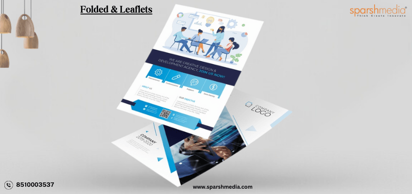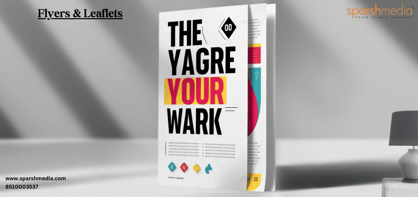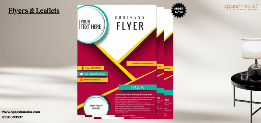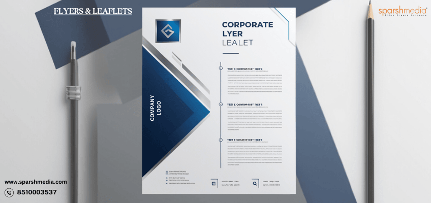
Printed folded leaflets are a timeless and versatile marketing tool that continues to hold significant value in today’s digital age. Despite the rise of online marketing, the tactile and visual impact of a well-designed leaflet can capture attention, convey essential information, and leave a lasting impression. In this blog, we will explore the key elements that contribute to the effectiveness of printed folded leaflets and how you can use them to elevate your brand’s communication strategy.
Introduction
Printed folded leaflets are an essential component of any comprehensive marketing campaign. Their unique design allows for the presentation of detailed information in a compact and organized manner. Whether you’re promoting a new product, sharing important information, or showcasing your brand, folded leaflets offer a tangible way to engage your audience. In this blog, we’ll delve into the art of designing printed folded leaflets that effectively communicate your message and resonate with your target audience.
Summary
This blog will provide a comprehensive guide to designing printed folded leaflets, focusing on key aspects such as layout, content, color schemes, and typography. We’ll discuss the importance of understanding your audience, selecting the right type of fold, and integrating your brand’s identity into the design. By the end of this blog, you’ll have a clear understanding of how to create printed folded leaflets that not only look great but also deliver your message effectively.
How can I choose the right type of fold for my leaflet design?
Choosing the right type of fold for your leaflet design depends on several factors, including the purpose of the leaflet, the amount of content you need to include, and the desired visual impact.
-
- Understand Your Content: Start by assessing the amount of content you have. If your leaflet contains a lot of information, a tri-fold or Z-fold may be ideal as these offer multiple panels to organize text and images neatly. For simpler messages, a bi-fold or single fold can be effective, providing a clean and straightforward layout.
- Consider Your Audience: Think about how your audience will interact with the leaflet. If you want to create a sense of discovery or storytelling, an accordion fold or gate fold might be appropriate as they reveal content gradually. For more formal or professional settings, a half-fold or letter fold is often preferred.
- Match the Fold to the Purpose: The purpose of the leaflet should guide your choice. For example, if the leaflet is meant to serve as a detailed guide or product catalog, a larger fold like a roll fold can accommodate extensive content. If it’s for a quick overview or handout at an event, a simple C-fold or Z-fold may work best.
- Visual Appeal: The fold type also affects the visual appeal of your leaflet. Some folds, like the gate fold or cross fold, can create a dramatic presentation, making your leaflet stand out. Consider how the fold will enhance or complement the design elements and the flow of information.
- Budget Considerations: Complex folds may increase printing costs, so it’s essential to balance your design aspirations with your budget. Simpler folds like bi-folds or tri-folds are typically more cost-effective while still offering versatility in design.
What are the key design elements to consider when creating printed folded leaflets?
When creating printed folded leaflets, several key design elements need to be considered to ensure that the leaflet is visually appealing, easy to read, and effectively communicates your message. Here are the essential design elements to keep in mind:
1. Layout and Fold Structure:
The fold structure of your leaflet dictates the layout, so it’s crucial to design each panel thoughtfully. Ensure that the content flows naturally from one panel to the next, guiding the reader through the information in a logical sequence. Consider how the leaflet will open and how the content will be revealed as the reader interacts with it.
2. Typography:
Typography plays a significant role in readability and setting the tone of your leaflet. Choose fonts that are easy to read, even at smaller sizes, and ensure there’s a clear hierarchy in font sizes to distinguish headings, subheadings, and body text. Avoid using too many different fonts; instead, stick to one or two complimentary typefaces to maintain a cohesive look.
3. Color Scheme:
Your color scheme should align with your brand identity and create a visually appealing contrast. Use colors strategically to highlight important information and guide the reader’s eye through the leaflet. Be mindful of how colors appear in print, as they can look different than on-screen. Test your color choices to ensure they print as expected.
4. Imagery and Graphics:
High-quality images and graphics can enhance the visual appeal of your leaflet and help convey your message more effectively. Ensure that images are relevant to your content and are of high resolution to avoid pixelation when printed. Consider how images will be positioned across folds to maintain a seamless look.
5. Content Organization:
Organize your content in a way that’s easy to navigate. Use headings, bullet points, and short paragraphs to break up text and make it more digestible. Consider the amount of space available on each panel and avoid overcrowding, which can make the leaflet feel cluttered and overwhelming.
6. White Space:
White space, or negative space, is the area of the leaflet left unmarked by text or images. It’s essential for creating a balanced design and ensuring that the content is not overwhelming. White space helps to highlight key elements and improves readability by giving the eyes a place to rest.
7. Call to Action (CTA):
A clear and compelling call to action is vital for driving the desired response from your audience. Place your CTA where it’s easily noticeable, such as on the final panel or the back of the leaflet. Ensure that the CTA stands out, using bold text, contrasting colors, or a distinct graphic element.
8. Paper Quality and Finish:
The choice of paper and finish can significantly impact the overall feel and perception of your leaflet. Heavier paper stocks and finishes like gloss or matte can add a touch of quality and professionalism. Consider how the finish will affect readability and color vibrancy.
9. Brand Consistency:
Ensure that your leaflet aligns with your brand’s visual identity. Use consistent branding elements, such as logos, colors, and fonts, to reinforce brand recognition. Consistency across all marketing materials helps build a cohesive brand image.
10. Practical Considerations:
Lastly, consider practical aspects like the size of the leaflet when folded, how it will be distributed, and whether it needs to fit into standard envelopes or display racks. These factors can influence design choices, such as the amount of content you include or the type of fold you use.
Understanding the Audience: The Foundation of Effective Leaflets
Knowing who you are trying to reach will influence every aspect of your leaflet design, from the language used in the copy to the colors and images selected. Consider the demographics, interests, and pain points of your audience. For example, a leaflet targeting young adults might feature bold colors and modern graphics, while one aimed at professionals could use a more subdued and sophisticated design.
Choosing the Right Fold: Maximizing Space and Impact
The type of fold you choose for your leaflet plays a significant role in how your information is presented and consumed. Common types of folds include:
-
- Half-Fold: A simple fold that divides the leaflet into two equal sections. Ideal for straightforward presentations.
- Tri-Fold: The leaflet is folded into three sections, providing a balance of space and organization.
- Z-Fold: A zig-zag fold that allows for sequential storytelling or step-by-step instructions.
- Gate Fold: Opens like gates to reveal the central content, perfect for creating anticipation.
Selecting the appropriate fold depends on the amount of information you need to convey and the desired flow of content. A well-chosen fold can enhance the reader’s experience and make the leaflet more engaging.
Design Elements: Creating a Visually Appealing Leaflet
Layout and Organization The layout of your leaflet should guide the reader’s eye through the content in a logical and visually pleasing way Prioritize information by placing the most important content at the top or in the center of each panel. White space is your friend; it helps prevent clutter and makes the leaflet easier to read.
Color Schemes Colors evoke emotions and can significantly influence the effectiveness of your leaflet. Choose a color scheme that aligns with your brand’s identity and the message you want to convey. Be mindful of color contrast to ensure readability, especially for text against backgrounds.
Typography Typography plays a critical role in setting the tone of your leaflet. Select fonts that are easy to read and reflect the style of your brand. Use a hierarchy in your typography to differentiate between headings, subheadings, and body text. Avoid using too many different fonts, as this can create a disjointed look.
Imagery and Graphics High-quality images and graphics can make your leaflet more engaging and visually appealing. Choose images that are relevant to your content and resonate with your audience. Ensure that all images are high resolution and properly aligned within the layout.
Content: Crafting a Compelling Message
The content of your leaflet should be concise, clear, and compelling. Begin with a strong headline that captures attention and summarizes the leaflet’s purpose. Follow with brief, informative sections that address the reader’s needs or interests.
Call to Action Every effective leaflet includes a call to action (CTA). Whether you want the reader to visit your website, make a purchase, or contact your business, your CTA should be clear and persuasive. Place it prominently in the leaflet, ensuring it stands out from the rest of the content.
Integration with Brand Identity
Your leaflet should be a seamless extension of your brand. Consistency in branding across all marketing materials, including printed folded leaflets, helps build trust and credibility with your audience.
Printing Quality: Making a Lasting Impression
The quality of printing can make or break the impact of your leaflet. Invest in high-quality printing services to ensure that colors are vibrant, text is sharp, and images are clear. At SparshMedia, we offer top-notch printing solutions that bring your leaflet designs to life with precision and professionalism.
Distribution: Reaching Your Audience
Even the most well-designed leaflet won’t achieve its goals if it doesn’t reach the right people. Plan your distribution strategy carefully. Consider direct mail, in-store distribution, event handouts, or including leaflets in product packaging. The method of distribution should align with your target audience’s preferences and habits.
The Environmental Impact: Sustainable Printing Options
In today’s eco-conscious world, sustainability is a key consideration in any marketing effort. Opt for eco-friendly printing practices, such as using recycled paper and soy-based inks. Highlighting your commitment to sustainability can resonate with environmentally conscious consumers and enhance your brand’s reputation.
Measuring Success: Tracking the Effectiveness of Your Leaflets
After distributing your leaflets, it’s important to measure their effectiveness. Track metrics such as response rates, website traffic, and sales conversions to determine the impact of your leaflet campaign. This data can provide valuable insights for future marketing efforts and help you refine your strategy.
Conclusion
Designing effective printed folded leaflets requires a careful balance of aesthetics, content, and functionality. By understanding your audience, selecting the right fold, and integrating your brand’s identity, you can create leaflets that not only inform but also engage and persuade. At SparshMedia, we are committed to helping you achieve your marketing goals with high-quality printed folded leaflets that leave a lasting impression.
Printed folded leaflets remain a powerful tool in the marketer’s arsenal. When designed thoughtfully and executed with precision, they can effectively communicate your message, enhance your brand’s visibility, and drive customer action. Embrace the art of communication through printed folded leaflets and watch your brand reach new heights.
VISIT MY ACCOUNT – SPARSHMEDIAPRINT
Frequently Asked Questions
What are printed folded leaflets, and how are they used?
Printed folded leaflets are marketing materials that are folded into sections, making them compact and easy to distribute. They are used to convey detailed information about products, services, or events and are often distributed at trade shows, in stores, or as part of direct mail campaigns.
What types of folds are available for printed leaflets?
Common types of folds include half-fold, tri-fold, Z-fold, and gate fold. Each fold type offers a different way to organize and present information, depending on your content and design needs.
How can I ensure my printed folded leaflet stands out?
To make your leaflet stand out, focus on high-quality design elements such as layout, color scheme, typography, and imagery. Additionally, using a unique fold type, eco-friendly materials, and high-quality printing can further enhance its appeal.v
What information should I include in my printed folded leaflet?
Your leaflet should include a compelling headline, concise and clear sections of text, relevant images or graphics, and a strong call to action (CTA). Make sure to align the content with your brand identity and the purpose of the leaflet.
How do I choose the right type of fold for my leaflet?
The choice of fold depends on the amount of information you need to present and how you want to guide the reader through the content. For example, a tri-fold is great for dividing content into three clear sections, while a gate fold can create a sense of anticipation as the reader opens it.
What are the benefits of using printed folded leaflets in a marketing campaign?
Printed folded leaflets are cost-effective, versatile, and provide a tangible way to engage with your audience. They can be easily distributed in various settings and offer a compact yet comprehensive format for presenting information.
How can I integrate my brand’s identity into a printed folded leaflet?
Incorporate your brand’s logo, colors, and tagline consistently throughout the leaflet. Use typography and design elements that align with your brand’s style to reinforce brand recognition and trust.
Is it possible to create eco-friendly printed folded leaflets?
Yes, you can choose sustainable printing options such as recycled paper and soy-based inks. Highlighting your commitment to eco-friendly practices can also enhance your brand’s image among environmentally conscious consumers.
How do I measure the effectiveness of my printed folded leaflets?
Track metrics such as response rates, website visits, or sales conversions that can be directly linked to the distribution of your leaflets. Surveys and customer feedback can also provide insights into how well your leaflet has performed.
Where can I get high-quality printed folded leaflets designed and printed?
SparshMedia offers professional design and printing services for printed folded leaflets. We can help you create eye-catching and effective leaflets that align with your brand and marketing goals. Contact us today to get started.v


